Archive | Art History RSS feed for this section

Artists of the Female Kind!

25 Apr

There has been much discussion on Twitter of late about continued bias for The Boys.  In articles, exhibitions etc – pause to mourn the ‘postponement’ of Artemisia at the National Gallery.  This would only be her second solo exhibition in over 400 years.

On Twitter @hotelalphabet asked us:
So if you could *only* pick 8 male artists for your #arthistory timeline, who? I choose: Leonardo, Durer, Michelangelo, Rembrandt, Duchamp, Warhol (I suppose), Picasso, Kiefer

For my part I came up with a very un-academic list of:

– Andrei Rublev
Unknown
– Hugo van der Goes
Hugo_van_der_Goes_-_Lamentation_-_WGA9653
– Giorgione

Accademia - La tempesta - Giorgione
– Durer
Unknown-1
– Ilya Repin
330452@2x
– Malevich
06iht-malevich06-picA-articleLarge
– Chagall
Unknown-2
– Anselm Kiefer
key-40
This was in reply to when @BarbieReports counted only 8 female and 66 male artists in @JANUSZCZAK (“brilliant I am sure!”) timeline. What if we reversed the ratio?

So here is my list of 66, in no particular order and not all with illustrations (this is because of my RSI not favouritism) obviously lots of Russian entrants:

Artemisia Gentileschi
Dora Mara
Paula Rego

images-4
Judy Chicago
Lavinia Fontana
Catharina van Hemessen
Kathe Kollwitz

Kathe

Yekaterina Belashova-Alekseyeva
Marina Abramovich
Tracey Emin
Margaret McDonald MacKintosh
images-5
Maggie Hambling
Angelica Kaufman
Mary Kessell

Kessell

Laura Knight
Winifred Knights
Beatrice Sandomirskaya
Sandomirskaya
Sofonisba Anguissola
Judith Leyster
Elisabeth Vigee Le Brun
Tatyana Yablonskaya

Yablonskaya
Berthe Morisot
Tamara De Lempicka
Frida Kahlo
Julia Frankenthaler

Thal

Louise Bourgeois
Leonora Carrington
AdĂŠlaĂŻde Labille-Guiard
Lee Krasner

krasner

Clara Peeters
Vanessa Bell
Sonia Delaunay
Kara Walker

images-3

Dorothea Tanning
George O’Keefe
Mary Cassatt
Natalia Goncharova

images-1

Zinaida Serebryakova
Olga Rozanova
Varvara Stepanova
Emily Carr

images

Lyubov Popova
Gwen Johns
Yayoi Kusama

images-2

Cindy Sherman
Rachel Whiteread
Aleksandra Exter
Sarra Lebedeva
Anne Desmet

Unknown-5

Ekaterina Zernova
Anna Airy
Norah Neilson-Gray
Maria Bri-Bein
Unknown-4

Sophie Call
Yoko Ono
Barbara Hepworth
Wangechi Mutu

Unknown-6

Sofonisba Anguissola
Levina Teerlinc
Madge Gill
Sarah Lucas
Saloua Raouda Choucair
saloua-raouda-choucair-composition-with-vertical-copy-2-1953-trivium-art-history
Fahrelnissa Zeid
Guerilla Girls
Helen Saunder
Vera Mukhina

Unknown-3


Brighton Museum

3 Sep

Brighton Museum
On the whole this is a wee gem so easily overlooked due to the proximity to the Brighton Pavilion.  The staff are relaxed and welcoming – so many museums could learn from their example.

This museum is the typical eclectic mix so prevalent in provincial institutions – from local history, local worthies (& their collections), local heroes, to art & design, Egyptian artefacts and then great art Zoffaney, Kauffman & Brangwyn to name three.

Plus temporary exhibits on 2 September 2018 this was Gilbert & George.  Unfortunately this latter exhibition took up a huge amount of the space which meant the permanent collection was relegated to nooks, stairs etc – a pity and meant this visitor had to make sure they have visited every room on the off-chance of seeing these works.  Many were hung in such a way that it was difficult to view them.

Existers 1984 by Gilbert & George born 1943, born 1942

Existers 1984 Gilbert & George

The selection of Brangwyn prints was stunning (see below) but as he gift 200 works a larger space, a wider selection and better lighting would be wonderful.  Perhaps in partnership with the V&A who have a great selection of his war posters.

FB PosterJPG

The Brangwyn prints demonstrate the force and physicality needed to service the industrial age.  The use of cross-hatching highlight the muscles of the men under strain.  Their darkness reflects the first and poor light which was still prevalent up to the 1980s.  With the demise of heavy industry and extensive cleaning projects has eliminated this view from our daily lives.

Those portrayed are types not individuals with their faces obscured.  So very different from the examples on displace at the Tate Britain’s ‘Aftermath’ – for example Otto Griebel ‘The International’ (1928)

Griebel The International 1928

Som of the most affecting moments are those discussing the rich history of the town from the iconic Mods & Rockers to the development of the LGBTQ community.

Mods n RockersJPG

Finally there is a lovely Grayson Perry pot near the entrance – ‘Difficult Background’ (2001). The quote from the artist “I just present things as they are, and if people think they are shocking, then that says a lot about them.”

Perry Difficult Childhood 2001 2

A W Clark September 2018

Holbein to Hirst

10 Sep

English portraits had followed a format using symbols and heraldry to depict the sitter. Their status, power etc could be descend by reference to the fashionable, expensive clothes, jewelry, heraldic emblems etc identifying how close they were to the court and thereby the sovereign. Combined heraldry was used to denote a marriage e.g. the Queen’s panel of Hugo van der Goes ‘Trinity Altarpiece‘ (1478/9) i.e. the marriage of James III or Margaret of Denmark. Crowns for Royalty, pearls for purity etc. Holbein developed a realistic style to depict the courts of Henry VIII & Elizabeth.

royal panels

100 years later van Dyke settled in England. His style had reflected his travels in Italy and his admiration for Titian and Rubens. However, in this last decade of his life he produced portraits which are said, not only to capture likeness but the character of his sitters. Symbolism is kept to a minimum, clothes and jewels become dominant rich with texture, light and colour. In many ways these portraits capture the theatricality and drama of the English Court.

The equestrian portrait of Charles I (1637/8) is illustrative of his practice. Here the King is in full command of his stead, in armour ready to defend his people. He gazes on all, the embodiment of a divine-right monarch before an English landscape. He holds his baton of command with the Garter Medallion around his neck. The elegance of the horse, the armour and his posture speaks to the fashions of the time. Behind him is a small tablet proclaiming him as King of Great Britain, a highly political statement given it was painted only 33 years after the unification of the crowns.

_fronts_N-1172-00-000053-WZ-PYR

Constable & Turner


These English contemporaries are known for their radical approach to landscapes but in subject matter and stylistically they were antipodes.

Constable, “fortunes’s child”, prosperous family, idyllic childhood. He was the ultimate ‘stay at home’ painter, specialising in the Stour Valley. Modern familiarity of paintings like ‘The Hay Wain’ (1821), [only recently toppled by Banksy in a recent poll], & ‘View of Salisbury Cathedral’ (1823) masque how radical his style was to contemporary eyes. By focusing on landscape and exploring naturalism (not realism; the hardship of the labouring classes never included); he was ignoring the academic primacy of historical painting. No doubt contributing to him not being inducted to the Royal Academy until the age of 52.

Turner’s upbringing would now be labelled ‘Dickensian’; city-born, working-class, maternal mental health issues. He was described as small, tough, taciturn, shrewd. He was well-traveled across UK and Europe. His early career witnessed him utilising traditional techniques and subject matter especially that of Claude Lorrain. Such conformity delivered almost an instant success and he became an academician at 26 i.e. 25 years before Constable.

His techniques became freer, although initially continued to reference the historic e.g. “Snow Storm: Hannibal and his Army Crossing the Alps” (1815). Eventually his subject matter was almost obscured focussing on the power of nature, light and emotion e.g. “Europa & the Bull” (1845).

They both enjoy enduring popularity (Turner came fourth in the aforementioned poll) because of their differences which continue to ‘speak’ to the public. Turner so modern, romantic, dramatic while Constable bucolic landscape fulfil a nostalgic need in an age of changing identity and global relationships.

3. Gainsborough & Hockney

Thomas_Gainsborough_-_Mr_and_Mrs_Andrews

Thomas Gainsborough Mr and Mrs Andrew


Mr and Mrs Clark and Percy 1970-1 by David Hockney born 1937

David Hockney Mr and Mrs Clark and Percy


Gainsborough and Hockney’s double portraits of newly weds are separated by 220 years. Both painters were known to the sitters. Hockney was a close friend of Ossie Clark and was their bestman. Gainsborough no doubt knew Andrews from their schooldays and he had painted her parents 3 years previously.

The Andrews are informally attired with their estate (her dowry) and the church where they married in the background. He is a member of the untitled landed gentry therefore his clothes are suitably worn.

Her informality is not as obvious to modern eyes but analysis identifies that she is wearing a two piece with mules and a straw hat. While he is relaxed, ‘at home’, she appears to be posed much like how Mr & Mrs Clark are depicted.

The Andrews’ is no dilettante farmer, the neat rows behind them is evidence of the latest farming practices. In addition, they lead the viewer into the landscape which projects the stability of this ‘tory’ social structure enduring like the oak.

The Clarks are in a modern, uncluttered flat. They are both fashionably dressed/groomed; he in flares and long hair, her in a maxi dress latest hair and make-up. All of this references their position as leading lights of the fashion industry, friends with artists like Hockney and customers including the coolest 60’s icons e.g. Rolling Stones.

Hockney includes his practice with a print of his ‘A Rake’s Progress’. Much has been made of the lilies as symbols of her purity and femininity; while Percy references Ossie’s disregard for social norms and fast- living. Certainly, Hockney would have known the Clarks very well but it is a stretch to say that he was prophcising that the marriage would fail.

larger

Arts Deco & Nouveau

9 Sep

Art Nouveau – was sensual/erotic style inspired by organic forms with fluid lines. There were clear influences from the European colonial acquisitions which varied depending on the national experience e.g. Chinese, Indian & Japanese stylisation and depiction of nature while Islamic cultures continued to influence with geometric design. All of this was in sharp contrast to Victorian design which reflected that age – moralistic, realistic, rigid, looking to the past e.g. Gothic or purity of craft influences.

As Art Nouveau spread across Europe the distinct national styles reflected increased patriotism in established countries and Empires or a sense of nationhood e.g. newly unified Germany & Italy or of those still partitioned like Poland. Other countries were seeking to distance themselves from former rulers e.g. Finland from Russia.

In Russia traditional crafts, like those explored at Abramtsevo (see featured image), fueled a form of Art Nouveau (stil modern) which was highly romantic and symbolic. The idea of the purity of Mother Russia uninfected by Westernisation was prevalent. Highly coloured reflecting traditional peasant styles with wood as the main material.

In Scotland, ‘The Glasgow Four’ looked to nature as well as Celtic design, myths and poetry e.g. Margaret MacDonald MacKintosh’s ‘Oh ye, all ye that walk in Willowwood’ (1903).

TGSE01213_m

Such geographic variations are most visible in comparing the metro designs in Vienna and Paris. In both cities the designs include organic forms and motifs in metal and glass. In Vienna, Wagner’s design is angular and symmetrical while in Paris, Guimard utilises highly stylised forms which appear to have been grown rather than fabricated.


Art Deco – This was the age of speed both in transport and communications. Art Deco’s main influences included geometry especially that found in nature which represented a departure from the stylised organic forms of Art Nouveau. Art Deco included a greater use of abstraction and projecting a sense of the industrial process and materials. It also linked the classical styles of Greece, use of columns and marble, with that of ancient Egypt and the lotus flower (part of the mania following the discovery of Tutankhamen’s Tomb).

This style influenced art, architecture, furniture, cars, decorative objects etc, etc e.g. Lalique’s ‘Spirit of the Wind’ (1925) reference classical statues, e.g.’ Victory of Samothrace’, and was also used as a car hood ornament.

It is an international style which projects power and modernity; reflecting a time of increasing national tensions coupled with increased militarism following the carve up of Europe in the aftermath of the Versailles treaties.

In the USSR Stalin’s metro stations were his pride and joy. Although the subject matter included the peoples of the Union; pastimes; depiction of the heroes of the Revolution all rendered in a distinctive Art Deco style e.g. Elektrozavodskaya station glorifies the light bulb and uses this as its main motif with 318 ceiling lamps.

foto-estacion-metro-rusia-moscu-Elektrozavodskaia

The high temple of Art Deco is the Chrysler Building (1928), its sleek lines, reflective materials all reference the car industry; the profits of which built it. The upper steeple references both the lotus flower and classical architecture with the gargoyles which were modeled on Chrysler hood ornaments.

chrysler-building-3

Architecture- Gaudi & Le Corbusier:

P1000733

Gaudi, Casa BatllĂł

ncvzk3mj-1401765288

Le Corbusier, Villa Savoye

Batllo and Villa Savoye were designed as private residences representative of the prevailing international styles. Both sought to depart from architectural Orthodoxy and utilised geometric principles: Gaudi the ‘Golden Ratio in Nature’ while Le Corbusier’s geometry was “coolly cubist”.

Renovated by Gaudi (1904-06), Batllo is an urban townhouse of organic, fluid, fantastical forms. The balconies are mask like, perhaps influenced by the interest in ‘primitive’/African Art. The roof defies traditional building forms including a Cross, waves, scales, the Montserrat geology etc.

These symbols reflect both Gaudi’s Catalan roots and Catalonian Nationalism e.g. scales reference dragons and thus St George the patron saint of Barcelona. Moderissme style looked to Gesamtkunstwerk, therefore, the interiors are fully integrated with the architecture, furniture and function. The practical design includes a rotating window system to provide invaluable ventilation. The materials are an eclectic mix of the traditional: ceramic, glass, stone, wrought iron, wood and plaster all handled by highly-skilled craftsmen.

Villa Savoye (1929) was a new build where Le Corbusier seems to have lost sight of both the functionality required of a domestic dwelling and the costs leading to his design being compromised. Although set in the countryside the design occupies the space on it’s own terms. Lloyd-Wright stated that “….with vast vanity trying to rise superior to it [ground] regardless of nature”.

The Modernist design with straight, clean lines reinterprets Greek classical design for the age of the car. Le Corbusier’s ‘Machine for Living’ sought a standardise design system and thus the materials included steel, glass, reinforced concrete without the need for craftsmen. These materials did not serve the building which became infamous for leaks.

‘Perceptions vs Reality’

28 Aug

The Museum of the History Of Polish Jews

in Warsaw, Poland (1)


“The museum is a legitimate institution. It, therefore, finds itself with considerable power….the images created by museums can buttress social identity and consolidate social position and class interests…..they can enable the opening of new ideas and the articulation of long silent questions. They can even provide the basis for an agenda for change.”(2)

This paper will consider the balance that The Museum of the History of Polish Jews will have to find between what visitors expect to find and reality of the millennium of Jewish life in Warsaw. The spectre of the Holocaust overshadows all of this but it is not the beginning or the end of the story as this museum is at pains to recognise.

This museum’s ‘Mission Statement’ (3) ‘simply’ states that it is to become a centre for education & culture, preserving & providing a lasting legacy of Jewish life in Poland and what was created in the course of that millennium. Therefore, this will principally be a museum of ideas and memory not just objects.

This mission statement sets out how Polish Jews were fundamental in the shaping of their locality, the City, the Nation, Europe and beyond. The Holocaust will not be ignored but it will be implicit much like the Jewish Museums in Vienna and Berlin. The premise is; to fully understand what was lost – ‘the Void’ – there needs to be a deep understanding of Jewish history, culture, society and commerce.

Barbara Kirschenblatt-Gimblett, the leader of the museum’s development team has emphasised the need for the museum to create a ‘Trust Zone’ i.e. to be accurate and fair. She explained in her interview with Contemporary Art Magazine that many worry that an honest account of Polish Jewry will reinforce the perceptions of Poland as an anti-Semitic country, while others are afraid that a rosy picture will presented. She hopes that this zone will facilitate discussions of “difficult” subjects, e.g. Jedwabne or the expulsions of 1968, and provide these contemporary debates with necessary “long and deep historical context”.

The concept of such a ‘Trust Zone’ is found wherever one set of people have been subjugated to another. Where this has happened, often an honest and uncompromising review of history has provided a means to build a lasting peace and reconciliation. Encouragingly, this issue is debated at the highest levels in Poland.

If you are from places like Cambodia, South Africa, Northern Ireland or the Highlands of Scotland such a zone is a requirement of any institution which wishes to accurately depict the past. In Cambodia the ‘official’ photographs of the executed stand witness to their own demise and these have been the focus of mourning, memory and healing. In Scotland, the depiction of the Highland Clearances and, in time, how ‘The Troubles’ will be presented in Northern Ireland will be key to reconciliation with the past and the present. As well as holding a mirror to unimaginable & incomprehensible events the museums in these countries also seek to provide a level of understanding by placing them accurately within the overall historical context.

In Warsaw, it is impossible to fully understand how the city developed and appreciate the level and extent of what has been lost without considering the 1000 years of Jewish life. In her book, ‘Lost Landscapes’, Agata Tusynska eludes to this:

“I did not know any Jews at least I thought I didn’t. No-one had taught me their history or customs. Or pointed out how deeply rooted they were in this land that was mine. No-one made me aware of the foundations of the centuries long Polish Jewish History.” (4)

Pre-partition, the word ‘Polin’ was used to describe Poland. It is derived from the Hebrew words ‘po‘ & ‘lin‘ which, according to Jewish tradition, implies a place of rest or the notion of Poland as a ‘safe place’. This set the country apart from the vast majority of European states, where anti-Semitism, expulsion, exclusion etc were common. As a result, the country became a magnet for Jews seeking relative refuge to live and work. This diaspora lead to a rich and diverse Jewish life, culture in Poland and not the homogeny which many depictions of the Shoah portray. The outcome was the largest Jewish community in the world, the centre of the Jewish world.

They were afforded communal autonomy based on special privileges. They were not confined in their economic life to purely subordinate occupations and they were not engaged solely in petty trade and money-lending. The Jewish community carried on important export trade, leased government revenues & large estates and, to a certain extent, agriculture. They were not restricted to ghettos like the German inhabitants. All these conditions contributed toward the evolution, in Poland, of an independent Jewish civilization. As a result of the social and judicial autonomy, Polish Jewish life was enabled to develop freely along the lines of national and religious tradition.

This was no Jewish ‘Shangri-la’ however, they ‘fitted’ into the lacuna which existed between the landlords, burghers and peasants. A much needed commercial class was developed which, as a result of its diversity and international connections, provided a foundation for economic success.

This ebb, flow and flood of the diaspora to and from Poland which created the largest Jewish community in the world demands a ‘Trust Zone’. People from across the world who have identified an European Jewish ancestor are usually able to trace links to Poland. Therefore, they come from across the globe seeking the ‘old country’ of their ancestral past. This is particularly lucrative for a developing economy and will go a long way to counter the view of Poland as just being about the Holocaust and Warsaw as merely a transit point on the way to Krakow and Auschwitz. However, there is a danger in this because the Poland that these visitors find may not be the one they seek.

The Highlands of Scotland has always had a marginal economic base and whose peoples have been scattered across the globe in a diaspora which spans centuries. Today the most lucrative form of income generation is providing visitors the ‘Highland’ experience. This is a mixture of ‘Brigadoon’(5) and ‘Braveheart’ (6) (both Hollywood movies which ‘depicted’ the Highlands). It is highly romantic view with a heavy reliance on tartan, bagpipes, shortbread and noble Highlanders all of which bears little resemblance to the modern, outward looking and confident Scotland of the early 21st century. In this view of Scotland, there is no place for an accurate portrayal of the clearances beyond the fact that it is the mechanism by which the visitors ancestors left the ‘old country’. Museums like the Highland Folk Museum in Newtonmore, must maintain reality against this backdrop if they wish to continue to be relevant to the people of Scotland.

Currently, there are waves of philo-Semitism (7) sweeping Europe and are evident in ŁódĹş & Krakow. For example, ‘Anatewka’ is a restaurant in ŁódĹş which the Easyjet magazine describes in the following way “[p]ortraits of wizen faces, elegant table cloths & violins on the walls decorate this Jewish restaurant which celebrates a culture all but lost in Poland….with miniature figurines ….souvenirs of ‘little’ jews”. Ruth Ellen Gruber (8) has described this phenomenon in the following terms “much of the visible Jewish culture in Europe today takes place without the involvement of actual Jews….Here Jews figure not as cultural agents but as symbolic figures; indeed, the absence, not their presence, is key”.

As experienced in Scotland, a ‘romanticised’ version is sought where visitors can either enjoy the first half of ‘Fiddler on the Roof’ (9) – quaint village life, lots of jokes, feel good songs and lots of dancing or wallow in the second half – dark foreboding music with pogroms, migration, poverty and a reference to the ‘inevitable’ Shoah to follow. However, this is tourism not history and this museum must ensure that only ‘truth’ is depicted to ensure that the ‘Trust Zone’ can be trusted by the citizens of Poland.

As Kirschenblatt-Gimblett mentions in the aforementioned interview, there was nothing inevitable about the Shoah in Poland. Therefore, the Museum of the History of Polish Jews in Warsaw will not start or end the history of Jews in Poland with the Holocaust. The museum has an open ended story which includes the post-Soviet, the creation of the museum and is well placed to capture the future of Polish Jewry as it unfolds.


End Notes

(1) This essay was written in 2011 when the museum was still a building site, it was for a Birkbeck course so there was a strict word limit and was developed from a 10 minute talk delivered on site.  Of course, it is now a real life museum which I hope, in the not too distant future, to finally visit.  Congratulations to all who fought so hard to make to a reality.  I did consider re-writing in light of this opening, as well as, to reflect the recent debates in Scotland in the run up to the Independence vote however, I would prefer to review once I have visited the museum and the outcome of the referendum is known.

(2) Gourievidis, L “Representing the Disputed Past of Northern Scotland: The Highland Clearances in Museums” – full citations in bibliography

(3) http://www.jewishmuseum.org.pl/index.php?lang=en

(4) A Varsavian born in 1957.

(5) 1954

(6) 1995

(7) An interest in, respect for, and appreciation of the Jewish people, their historical significance and the positive impacts of Judaism in the history of the western world, in particular, generally on the part of a gentile.

FUTURISM!!!!!

25 Aug


Why 20th Century Northern Italy?

futurists

Russolo, Carra, Marinetti, Boccioni and Severini


INTRODUCTION

This paper’s focus will be on the Italian Futurist painters in the years between the publication of “The Founding and Manifesto of Futurism” (1) in 1909 and Italy’s declaration of war on Austro-Hungary in 1915.

The leading painters who signed this manifesto included:

Giacomo Balla (1871 – 1958), painter, designer of furniture and ‘anti-neutral’ clothing.

Umberto Boccioni (1882 – 1916) painter, sculptor & pupil of Balla. He published ‘Pittura e scultura futuriste (dinamismo plastic)’ (1914) which set out the aesthetics of the group:

“While the impressionists make a table to give one particular moment and subordinate the life of the table to its resemblance to this moment, we synthesize every moment (time, place, form, colour-tone) and thus build the table.”(2)

Carlo Carra (1881 – 1966) painter & art theorist.

Luigi Russolo (1885 – 1947) perhaps the most revolutionary of the group who combined his painting with his interest in music. He became the first ‘noise artist’ and theorist of electronic music (3).

Gino Severini (1883 – 1966) painter who also worked in mosaic and fresco.  He was also a pupil of Balla. 

WHAT IS FUTURISM?

“…put simply Futurism means hate of the past, our aim is to energetically combat and destroy the culture of the past…” (4)

In 1910, a group of Italian painters signed their own manifesto, “Futurist Painting: Technical Manifesto”. This document was inspired by Marinetti’s Manifesto of the previous year and referenced their earlier public declaration of March that year in the Chiarella Theatre, Turin.

They rejected:

  • The romantic notion of the artistic genius.
  • The concept of autonomous art. They believed in the immersion of art in everyday life – leading to a rejection of cubism as overly intellectual and static (see section 4).
  • The past artistic endeavours particularly of Italy which the viewed as a mausoleum being held back by part glories. They believed that only Futurism could provide the type of government that could carry out the cultural housekeeping they believed that society needed i.e. sweep away the past.

They embraced:

  • Integration of art in society – illustrated by the portrayal of the changes in popular culture which is the subject of Severini’s ‘Blue Dancer’ (Fig 2) which captures the movement and energy of the dance. 

blue-dancerFig 2 (1910-11)

  • A pervasive interest in the city, agitation and dynamic forms as subjects for their art. Unlike most art movements, instead of turning their backs on the machine age they passionately embraced it.
  • Violent change; similar in many ways to the Hegel dialectic of thesis, antithesis clashing to produce synthesis and thereby moving forward, prevalent across Europe at this time.
  • The Italian Divisionist movement (see section 4).
  • Art’s shock value.
  • Simultaneity; objects are not static but are constantly moving and it is essential to depict this movement. They utilised Divisionist techniques as well as developments in photography and cinematography. Fig 4 illustrates the technique of working with memories, emotions, and associations.

“on account of the persistency of an image upon the retina, moving objects constantly multiplying themselves; their forms change like rapid movements are triangular”. (5)

  • The conception of reality as emotional, dynamic i.e. ‘universal dynamism’. Artists had to be aware that objects/individuals in life did not exist in isolation to their surroundings; objects are penetrated by their surroundings. Objects must be viewed in relation to its environment. This concept is illustrated in Fig 3, a female figure gazes down at an unfolding scene while simultaneous it is coming from the top of her head, she is reflecting on what she is seeing i.e. the painting is representing perceptions.

simultaneous-visions

Fig 3 ‘Simultaneous Visions’, Boccioni, 1911

SOCIO-POLITICAL CONTEXT

 “In the eyes of other countries, Italy is still a land of the dead, a vast Pompeii, whit with sepulchres. But Italy is being reborn. Its political resurgence will be followed by a cultural resurgence.”(6)

Early 20th Century Italy was a product of:

  • The unification in 1861 with Rome becoming the capital in 1871. To develop a sense of national identity the vogue for art reflecting great figures and events of the past was encouraged e.g. Roman grandeur, Dante’s poetry, the imperial glory of Venice, the artistic dominance of Florence etc.
  • 40 – 50 years of crisis; a country torn between tradition and change or in the eyes of the Futurists tradition and modernity. Anarchy & violent protest were met with government oppression. As illustrated by Carra’s ‘Funeral of the Anarchist Galli’ (Fig 4).  Angelo Galli was killed during the general strike in Milan, 1904. Carra attended the funeral and made his preparatory sketches on his return home. He described how “sticks and lances clashed’ i.e. the workers with the police. The painting is typical of the Futurist style – countless figures are dynamically interlocked in violent, unified action. It was painted from memory seven years after the event and it is clear that Carra is representing not just the visual impressions but also the emotional impact.

futurism_heroic_carra_il_funerale_dellanarchico_galli

Fig 4 (1911)

  • The relative wealth of the industrial, literate North and the extreme poverty and illiteracy of the South. Rapid industrialisation at a faster rate than the rest of Europe (7) only served to widen this gulf further.
  • The alienation of the ruling and intellectual classes as they saw their traditional role and social standing eroded in light of the rise of the working classes and urbanisation. This is celebrated in Boccioni’s ‘City Rises’ (Fig 5) and demonstrates that these events/developments are not merely the backdrop but exerted direct influence on the Futurists. It captures the dynamism of a city waking with work and traffic getting underway. The swirling vortices created by short brushstrokes in vibrant colours combine to project vigour and energy. The objects flow into each other forming a continuum of motion. Boccioni is using these motifs as a metaphor of the city entering the industrial era.

Boccioni-The-City-Rises-1910

Fig 5 (1910-11)

As the quote at the beginning of this section highlights, the Futurists rejected the need to celebrate the past which they believed was holding Italy back and sought to develop a new symbolic language (8).  In Balla’s ‘Street Light’ (Fig 6) the ‘Segantini Stitch’ (small strokes of pure colour) is used to great effect. The imagery is far from suitable, the light of technology outshining nature in the guise of the moon i.e. Italy moving into the light of a modernity.

street-light-1909

Fig 6 (1910-11)

THE DUAL AESTHETIC INFLUENCES

This Futurist’s manifesto predated the development of the artistic manifestation of their beliefs and vision. The two predominant aesthetic influences on Futurist painting were:

(i) Divisionism

“We conclude that painting cannot exist today without Divisionism. This is no process that can be learned and applied at will. Divisionism for the modern painter, must be an innate complementariness which we declare to be essential and necessary” (9)

Despite Marinetti’s repudiation of all previous forms of art, the Futurist painters declared an exception – Divisionism. This was a particularly Italian style of pointillism:

“….. an avant-garde painting technique practised ….in and around Milan during the 19th Century. The depiction of light was fundamental……the Divisionists aimed to make art an instrument of social change…..”(10)

Perhaps the most obvious link between Futurism and Divisionism is Balla (many see him as the pre-Futurist) who taught both Boccioni and Severini. Although, he is chiefly known for his contribution to Futurism, when he signed the 1910 Manifesto he was already a mature and established artist. He shared the avant-garde belief that an artist’s education should not be exclusively academic especially the Old Masters, this fervently adopted by the Futurists.

His Divisionist techniques, especially his scientific approach to the handling of colour, are evident in ‘Girl Crossing a Balcony’ (Fig 7). He was inspired by the ‘photo-dynamism’ of the Bragaglia brothers (Fig 8) – using multiple forms as a way of conveying the impression of movement. All the objects within the painting, the girl, the balustrade & the doorframe, melt into a vibrantly coloured plane – diffusing into patterns of colour and thereby negating spatial perspective i.e. deconstructing and reconstructing a whole sensation.

Balla - young girl running on the balcony - 1910

   bragaglia-f

                                                                 Fig 8

                  Fig 7 (1912)

Although Balla was a huge influence on his Futurist colleagues it was the way that the Divisionist techniques could be used to convey motion, even speed or velocity that was one of the key reasons why it was so favoured. For example, Balla’s ‘Dynamism of a do on a leash’ (Fig 9), the technique conveys the way a little dog’s legs blur when trying to keep up with their owner.

4843229

Fig 9 (1912)

Another key factor of Divisionism which attracted the Futurist painters is the aforementioned scientific or modern approach to colour theory. In essence, colour theory involved the use of contrasting colours, opposite to each other on the colour wheel. These opposites provide emphasis, depth, solidity and mass as well as a unity across the canvas by echoing colours from other parts of the painting.

(ii) Cubism

An avant-garde movement centred in Paris, pioneered by Picasso and Braque. The theory was to use all images that formed movement and superimpose them into single frame i.e. the eye to sees all images at once which would form a linear film. This non-objective painting and sculptural method reduced/fragmented natural forms into abstract, often geometric structures.

The Futurists had first hand knowledge of Cubism; Severini lived in Paris and Boccioni, Carra & Russolo visited in 1911. The impact of these visits were immediately apparent e.g. in dramatic difference between Boccioni’s first & second versions of ‘The Farewells’. The first version, painted before the visit, (Fig 10) has 3 or 4 couples saying ‘goodbye’ at a railway station. The figures are shrouded in steam which represents their emotions. The painting is classic Divisionist style, uniform, fluid, conveying emotion and movement.

states-of-mind-the-farewells-or-study-umberto-boccioni

Fig 10 (1911)

The second version was painted after the visit (Fig 11) & is in the Cubist style. There is a locomotive, its number clearly visible, surrounded by couples, angular, in green. This painting has greater articulation, the different perspectives are clear although the dynamism apparent it is less emotional and somewhat static compared to the original.

CRI_61328Fig 11 (1911)

Here lies one of the two main problems that the Futurists had with Cubism. It lacked the emotion and velocity which they sought to achieve. Movement through simultaneous vision captured the moment but not the movement through time and did not necessarily capture the emotional impact. The second problem is that the Futurists regarded Cubism as intellectual which kept them apart from society. This is in direct contradiction to the immersion that Italians sought to achieve. The Futurists did ‘mimic’ some of the Cubist elements for descriptive purposes combining these with the Divisionist’s use of brushstrokes and colour theory to achieve an engaging depiction of velocity and emotion.

THE CATALYST F.T. MARINETTI – the Politician & Publicist

Carlo-Carra-1910-Marinetti-420

Carra Portrait of the Poet Marinetti, 1910

“We stand on the last promontory of the centuries!….Why should we look, back, when what we want is to break down the mysterious doors of the Impossible? Time and Space died yesterday. We already live the absolute, because we have created eternal, omnipresent speed”(11)

Although the socio-political landscape and the aesthetic influences were in place, the Futurism needed a catalysis to galvanise the outbreak of creativity and manifesto writing which propelled the movement into being. Marinetti had the wealth, the education, the international outlook and the ego to enable him to apply all his energy and determination to promoting his ideology.

The 1909 Manifesto describes Marinetti’s ’road to Damascus’ moment when he survived a road accident. He emerged from the ditch, quite literally, a changed man seeing the potential of technology and speed over nature and man.

The Manifesto constantly refers to the themes of movement, technology and violence the language used is emotive, descriptive, engaging but not intellectual or remote:

  • ‘gorges of the sea’; ‘swept us out of ourselves’; ‘drove us’ ‘raced, hurling’
  • ‘hellish fires of great ships’, ‘roar of automobiles’, ‘trembling aeroplanes’
  • ‘army of hostile stars’, ‘red sword slashing’, ‘hurls the lance’

Marinetti’s original manifesto was published in Le Figaro, this alone ensured the publicity maximised and the message was spread beyond political &/or art circles. This demonstrates his skills as a publicist which were essential to Futurism. He sought to increase engagement, provoke dialogue by increasing notoriety and thereby attaining further coverage. All of this is a very modern approach to media management. His skills are similar to a modern day political campaign manager, and given his political ambitions this is not so surprising.

He reached a mass audience through audacity and inventiveness, promoting manifestoes on numerous subjects in addition to politics and painting, there were manifestoes on prose, lust, cinema, sculpture, noise, theatre and weights & measures. These were published in a number of languages and distributed though newspapers, wall posters, and leaflets.

They were distributed using a variety of methods including stage managed events or ‘happenings’, for example:

  • Tracts ‘Against Venice’ were thrown into the Piazza San Marco
  • Thrown from Taxis in Berlin
  • Events in theatres usually with Marinetti acting as the master of ceremonies where his collaborators deliberately provoked the audience leading to violence, arrest resulting in more publicity.

All of this activity ensured that Futurism’s reach and influences stretched far beyond the artistic circles of the Italian industrial North.

FUTURISM’S LEGACY

Although, many have dismissed Futurism as ‘Cubist wannabes’, ‘proto-fascists’, dilettantes and/or bad artists; the movement continues to exert a great deal of influence on many forms of artistic endeavour including theatre, graphic design,  art, cinema etc. Boccioni’s ‘Unique Forms of Continuity in Space’ (Fig 12) is the ultimate statement of dynamic power and the technological man. Given Futurism’s internationalism and chauvinism it is somewhat appropriate that it was chosen by the Berlusconi Government to adorn the Italian 20 Eurocent coin (Fig 13).

Unique Forms of Continuity in Space 1913, cast 1972 by Umberto Boccioni 1882-1916

Fig 12 (1912)

g915

Fig 13 (2002)

This dynamic mechanical man continues to influence movie aesthetics, where these ‘men’ are initially view with suspicion but ultimately prove to be more effective in the fight against evil e.g. Figs 14 & 15.

Untitled    Fig 14 “Terminator” 1984

robocop-figma-poe-ghostal-review-1

Fig 15 “Robocop” 1987

Sant’Elia was the author of the ‘Manifesto of Futurist Architecture’. His monumental buildings have clean lines and devoid of any architectural decoration (Fig 16). This has continued to influence works of science fiction including graphic novels, cinema etc. – e.g. Katsuhiro Otomo’s ‘Akira’ (Fig 17) & Ridley Scott’s iconic ‘Blade Runner’ (Fig 18).

saint_elia01

     Fig 16 (1914)

city

Fig 17 (1982)

screenshot-lrg-171

Fig 18 – 1982

END NOTES

(1) Le Figaro, Paris, 20 February.

(2) Quoted on p303 of ‘Gestalts and Pictorial Worlds’, Jan Koenderink, Vol. 33, No.3/4, (2011) pp289-324 (last accessed 25 August 2014).

(3) An example of his “Veglio Di Una CittĂ “, recorded in 1913.  

(4) “The Founding and Manifesto of Futurism”, Martinetti, 1909

(5) See Footnote 2

(6) Manifesto of Futurist Painters, 11 February 1910.

(7) Industrial output increased by 6.7% p.a. from 1896 to 1908 and the per capita income in 1910 – 14 was 28.8% higher than in 1896 – 1900 (Encyclopaedia Britannica, 1995).

(8) Quite literally in the case of F T Marinetti’s “Destruction of Syntax – Imagination without Strings – Words-in-Freedom”, 1913.

(9) See footnote 2

(10) “Radical Light: Italian Divisionist Painters 1891 – 1910”, exhibition leaflet, National Gallery, London (18 June – 7 September 2008)

(11) See footnote 2

Author’s Note – This is the third assignment which lead me from Pointillism, via Divisionism to Futurism.

Radical Light:

25 Aug

Italy’s Divisionist Painters 1891 – 1910

Exhibition Catalogue (1)

The National Gallery

18 June – 7 September 2008


51LZcXiKStL._SY300_


INTRODUCTION

The sponsors and directors’ forewords provide the only introduction to this catalogue and therefore the topic:

“The Divisionsts used the principles of optical science to combine colour and light in a new style that explored Italy’s evolving national consciousness as the 20th Century dawned. Chief among these principles was the notion that unmixed threads of ‘divided’ colour would fuse for the viewer at a distance, bringing maximum luminosity to the paintings (2)”

The directors’ foreword (3) highlights that the Italian Divisionists were not a unified style, school or group. Their styles ranged from:

  • confused surfaces of Scapigiatura;
  • to the separated touches of paint of Macciaioli;
  • to the futurist style of Russolo.

These forewords point out that as well as being an extension of the French Neoimpressionism, the Italian Divisionists also ran parallel to this art movement. They also highlight that the debt owed to Jean François Millet is clearer than that to Georges Seurat e.g. the naturalism and realism of the peasant paintings as well as the use of symbolism.

THE FORMAT OF THE CATALOGUE

The Forewords – see above

Essays:

  • “Italian Divisionism and its Legacy”– provides ‘the context’ to the movement;
  • “Divisionist Painting Techniques” – ‘the how’;
  • “Divisionism to Futurism Art and Social Engagement – ‘the why’;
  • “Divisionism Symbolist Ascent’ – ‘the what’.

The Plates – of all the paintings exhibited at The National Gallery, Kunsthaus Zurich or both. Although the essays are illustrated through out these high quality plates are reproduced in this section, one per page.

Notes On Artists & Paintings – provides, in alphabetical order, detailed biographical data of each artist and information on the exhibits as well as important works not on show (these are clearly marked). Each entry includes an illustration of each work, this ensures that cross-referencing with the larger plate, and the exhibition or undertaking further research is effortless. This section enables this catalogue to act as a reference resource beyond the scope of the exhibition.

Chronology from 1876 to 1915 – This is extremely useful section of the catalogue. Each year is considered in turn under the headings – Art, Culture & History. This allows the audience to clearly understand the sequence of events in all three subjects when considering each artwork. In addition, although many will have knowledge in one or two of these subjects few will be familiar with all three and thereby this section will also be useful to the academic reader.

Bibliography – this is extensive and has been used as the basis for the bibliography in Appendix A (4). The catalogue acknowledges that this artistic, political & social movement is almost uniquely Italian and little known in the UK. The academic reader will find this section invaluable as it provides details of:

  • the antecedents as well as the artistic, social, political, philosophical and scientific influences on the Divisionists;
  • their artistic etc contemporaries;
  • contemporary writing on the subject;
  • how the legacy of this movement influenced Futurism and Cubism which followed –
  • details of exhibitions on this subject across the globe.

Index – as a former archivist and researcher this author is always heartened to find such a section. It allows this catalogue to efficiently navigate by the casual to the academic reader.

CRITICAL OVERVIEW

The catalogue has no introduction or overview of the exhibition. This can be found in the accompanying booklet:

“Divisionism was an avant-garde painting technique practised by a group of Italian artists working in and around Milan during the 19th Century. The depiction of light was fundamental to [their]……The recent unification of Italy along with industrialisation had resulted in a turbulent economic climate……the Divisionists aimed to make at an instrument of social change…..[their] radical technique and their espousal of social ideas laid the ground for futurism…..”

The booklet then considers the exhibition room by room and thereby provides a very short thematic consideration of the movement – something the catalogue by and large ignores:

  • Landscape & Rural Life
  • Grubicy & Symbolism
  • Social Issues
  • Workers
  • To the Future.

This lack of introduction, to the catalogue, means that the reader is plunged headlong into a dense & detailed academic essay reviewing ‘the context’ thereby excluding a large section of a National Gallery customer base. The ‘running order’ of the essays could be more logical i.e.:

  • ‘the how’;
  • ‘the why’;
  • ‘the what’;
  • & then ‘the context’.

This would have allowed each essay to build on each other. As stated before the exhibition material highlights that this is not a familiar topic for a UK audience therefore methodically leading the reader would have been a customer-centric approach no matter their level of understanding etc.

Simon Fraquelli is on record as the editor of the catalogue but from the layout and content this editing is not readily apparent, in fact, there is an element of repetition between each essay. Some of the essays do not appear to have been written for such a catalogue.

This catalogue can do no more than give a taste of the subject and provide information which requires further study, reflection and research. It is by & large successful especially where the essays link visually to the exhibition taking full advantage of the excellent quality of the plates.

DETAILED REVIEW OF THE ESSAYS

“Italian Divisionism and its Legacy”‘the context’

imagesLightning (I lampi), 1909-10,

by Luigi Russolo


Simonetta Fraquelli is an independent art historian and a specialist in 20th Century Italian art. This author is obviously very familiar with her topic and has written a highly academic essay reviewing the Italian Divisionists within the European post-impressionist landscape and the backdrop of the socio-political tensions of late 19th and early 20th century Italy.

She highlights that this is not a homogeneous group and that this reflects their various distinctive styles as well as the ‘lively cultural milieu” of commercially dominant Milan. The influences of Chevreul, Rood and the French Pointillists are all identified but with little discussion as to what they are or how they manifest their influence in Italy.

This essay does not appear to relate directly to the exhibition, the educational ethos of The National Gallery or the lack of familiarity with this subject within the UK. The language used demands a detailed knowledge of art, in general, and Divisionism, in particular.

“Divisionist Painting Techniques”‘the how’

Grubicy_de_dragon-sea_of_mist

Sea of Mist (Mare di nebia), 1895

by Vittore Grubicy de Dragon


Aurora Scotti Tosini is an expert on Divisionist painting and technique. This essay provides a logical review of the theories informed this movement. In particular, the theories of Chevruel and Rood are considered as well as the new materials available with which the Divisionist painters experimented.

Each of the leading lights of the movement are considered. Grubicy is identified as the driving force of Italy’s brand of Divisionism especially how he directly influenced Segantini to adopt the style for his second version of “Ave Maria Crossing the Lake” (5).

Tosini has produced an introduction into the techniques of the Italian Divisionists which so vital to any understanding of the movement. In this, she has considered a typical National Gallery audience i.e. that it is ‘typically’ of the widest spectrum of knowledge, understanding and cultural backgrounds. The essay is no less scholarly work for this – it wets the appetite for further research and study which is the National Gallery’s purpose.

“Divisionism to Futurism Art and Social Engagement”‘the why’

reflections-of-a-hungry-man-or-social-contrasts-emilio-longoni

Reflections of a Hungry Man or Social Contrasts

(Riflessioni di un affamto or Contrasti sociali), 1894

by Emilio Longoni


Giovanna Ginex is an expert on Divisionist painting. This essay provides a detailed account of the socio-political backdrop including the unification of Italy, industrialisation, the fledgling democracy, the assassination attempts on the king which finally succeeded in 1900.

How the Divisionists communicated their political beliefs is described most eloquently by considering Longoni’s painting (above) – the harsh lines and drab brown colours of the hungry man looking in on the warmth and soft interiors; the glass window literally divides them. The essay ends with clearly establishing the links with the Futurist movement which would be the successor movement.

This essay avoids the use of overly academic conventions and thereby communicates with the widest possible audience. It links directly to the exhibition and makes the most of the excellent quality of the plates.

“Divisionism Symbolist Ascent” – ‘the what’


Giovanni_Segantini_004

The Bad Mothers (Le cattive madri), 1896 – 97

by Giovanni Segantini


Vivien Greene is Associate Curator at the Guggenheim Museum, New York. This essay provides explanations for the many symbols utilised by this movement. This is vital for a modern UK audience which has little in common with turn of the century Italy. The use of traditional Christian symbols initially appears incongruous, Greene is at pains to show how the Divisionists may have been avant-garde even revolutionary but they were still products of their society (Catholic) and their education (the old masters).

This essay uses Segantini’s ‘Bad Mothers’ (above) to link the proposed idea that women rely on the pre-ordained roles prescribed by both Christians as well as revolutionary theory i.e. Madonna and the Revolutionary Mother which was developed so successfully in Soviet Russia. Greene draws parallels between the convulsed figure of Mother with Bernini’s St Teresa in Ecstasy (6).

This visual approach linking these themes directly to the exhibition communicates directly to the widest audience while remains academically sound. 

CONCLUSION

This assignment was to critically consider an exhibition catalogue.  On the whole, this tome meets the brief for all but the most casual visitor but would they be the target audience for such a publication – unlikely.


End Notes

(1) “Radical Light: Italy’s Divisionist Painters, 1891-1910”; Simonetta Fraqualli, Giovanna Ginex, Vivien Greene, Aurora Scotti Tosini; (2208); London: National Gallery Company Ltd

(2) Credit Suisse (Sponsor) Catalogue, p4

(3) Nicholas Penny, The National Gallery & Christoph Becker, Kunsthaus Zurich, p5

(4) author – unfortunately not figured out how to add such a table to this website.

(5) Figure 6 page 14 

(6) Church of Santa Maria della Vittoria, Rome. 1645 – 52


Author’s Notes – this assignment was to critically review an exhibition catalogue.  Consider the lay out of the publication, how the handled has subject and how (or if) it informed the audience from tourist to Divisionist expert.  The illustrations were chosen from the paintings within the exhibition and were either mentioned or reflect the subject matter of each essay. This is the middle assignment between a visual analysis of George Seurat and the final assignment on the Italian Futurists.


The Bridge at Courbevoie

25 Aug

my first visual analysis

 The-Bridge-at-Courbevoie

Artist: Georges Seurat

Year: 1886 – 7

Location: The Courtauld Gallery London

Size: 18.3” by 21.8”

Medium: Oil in Canvas

Frame: Heavy, ornate dark gold which picks out the dark and yellow moments in the work.

Style: Divisionism also known as pointillism.


NARRATIVE

The scene is of three solitary men on the bank of a river. In fact, the painting is of the river Seine, from the island of La Grand Jette, south of Paris. These men do not related to each other or the audience and thereby the feeling of isolation, reflection & calmness is projected. In addition there is a boat with two figures, these are not well defined and neither is the shore under the bridge, suggesting that they are in the distance. This use of perspective adds depth as well as breadth to the painting.

The top third of the picture is almost totally dissected by a modern bridge behind which is a smoking chimney stack. These images are the only signs of the modern industrial age. They suggest industrialisation encroaching into the calm stillness of river life – a simpler age. This is a common theme of the time and something Seurat includes in a number of his paintings e.g. “Bathers at Asnières”. It could be said that the artist’s dissatisfaction with these developments are reflected in the mood of the solitary figures – sad, disaffected.

 seurat-Bathers-at-Asnieres-

This mood is also reflected in the bare, black tree in the foreground to the right of the picture. Given that the other tree in the foreground, top left hand corner, is in full leave and the grass is very green it could be suggesting the passing of seasons or even eras.

From a distance (it is recommended to view from a distance between 6 – 7 feet) the picture appears to be misty as in early morning. This emphasises the overall stillness and silence of the whole picture. No movement is depicted except for the wind that appears to be from the right in the distance (the smoke from the chimney) and from the left in the middle ground (the sail). There is also no activity depicted except for the hint of industry from the chimney and perhaps a fishing rod in front of the man second from the left.

DIVISIONISM

As you come closer to the picture your eyes become aware of the trick that has been played upon them. This is the effect that the pointillist technique depends upon. Unlike his other works there are very few actual brush strokes. This is why this picture is one of the clearest examples of the technique of divisionism (this is the term favoured by Seurat).

The picture is mainly build up from layers of dots that give the whole work a matt/flat finish despite being painted with oils. This technique adds texture which also adds depth and texture. The only areas where there appears to be brush strokes, almost crosshatching, are in the dull and overcast sky; in the base greens of the grass and; in the foreground. This overcast sky and the lack of shadow makes it difficult to determine the direction of any light source therefore it maybe coming towards the audience through the mist?

COLOUR

Divisionism requires a thorough knowledge of colour theory something which this painter devoted a great deal of time and study. This produces a near scientific approach to the application of colour because contrasting colours, opposite to each other on the colour wheel, are used to provide emphasis, depth, solidity and mass. These colour contrasts also provide a unity across the canvas by echoing colours from other parts of the painting.

It is easier to use a picture of a colour wheel than to try to describe it:

color_wheelFrom a distance the dominant colours are greens, greys and purples. However, as you move closer it is clear that:

  • all the darkest elements, the fence to the left, the jetty and the aforementioned dark tree on the right all include red and pink dots;
  • the greens of the grass and the other tree have red and yellow dots;
  • while the purples of the bridge and the sail include orange and yellow dots.

Many have stated that Seurat’s technique was not satisfactory however; in this work it enables him to create the previously mentioned atmosphere.

The dots are more defined in the reflections in the water. By making these dots more distinct and by utilising more contrast colours the reflections appear to be rippling with the water

COMPOSITION

The dominant features across this picture are the numerous verticals – the poles in the water, the three figures, the sail, the chimney, the fence and the reflections. These lead the eye across the whole of the canvass, providing a unity as well as subtle contrast to the boldness of the diagonals and horizontals:

  • There are some bold horizontals with the bridge, the indistinct far distant opposite bank, and the jetty all of which give further depth to the image.
  • There are only a couple of diagonals in this work created by the grass bank in the foreground and echoed in the fence. This adds to the perspective and suggests life in the greens on the left of the picture.
  • The only curves are in the underside of the bridge, the sail and its reflection as well as the solitary dark tree. These curves draw emphasis to these motifs modernity, leisure pastimes (or traditional trades) and the dead blackened nature on the left. This again appears to suggest passing from one era to another – nature on the green right to industry on the black left?

CONCLUSION

This painting was chosen for this assignment because of the depiction of the stillness, calmness, the contemplation and the tranquility that clearly co-exists within an urban landscape. The use of colour is subtle but truly effective in evoking the feelings and atmosphere discussed above. When living in a very large city such moments need to be appreciated.

Author’s Notes – this was the start of my formal History of Art study.  The assignment was to visit a gallery and write a visual analysis with a very strict word limit.  I would build on this with my next assignments on Italian Divisionism (a review of a exhibition catalogue) and the Italian Futurists.

Reboot 2.0

11 Oct Burlaki

Hello again – no this is not the start of a Lionel Ritchie song.  I should begin with an apology, I abandoned you but I have a really good reason/excuse.  I have now successfully completed the Graduate Certificate in Art History with Birkbeck University in London.  Part of this was a dissertation which was only 7000 words but it seemed to be much, much longer.   I actually managed to attain the desired 2:1!!! This means I have an unconditional place on the masters with Birkbeck for the next 2 years BUT I have decided that combining this level of study with work with having a life impossible.  This is why I have not had time to add to this blog.   I have decided to postpone the masters until my retirement which not far in the future.

I also visited Moscow for the first time.  Both were actually linked as my dissertation considered Ilya Repin’s ‘Burlaki’ or  ‘Bargehaulers of the Volga’ (1870) – I will post in chunks in the coming weeks.

So watch this space.

How Iconography saved Art during the Scottish Iconoclasm – a thought piece

23 Mar

How Iconography saved Art during the Scottish Iconoclasm – a thought piece

Image1

“We have to ask ourselves whether or not the symbolical significance of a given motif is a matter of established representational tradition . . .; whether or not a symbolical interpretation can be justified by definite texts or agrees with ideas demonstrably alive in the period”2

Introduction

This essay seeks to demonstrate that an iconographic approach alone is inadequate when considering Northern Renaissance art. The premise will be explored by considering how the iconographic motifs were perceived at the time, in the context of society and how such perceptions changed over time.

All of this will be explored with reference to Hugo van der Goes’ ‘Trinity Panels’. This is a wholly theoretical exercise because there is no evidence to explain the patron or donor’s intentions or the disposition of the panels during the 16th century3.

Changes in the perception of the panels’ iconography may provide a key to their survival. The iconoclasts were not indiscriminant vandals; they vented their spleen on devotional objects viewed as ‘graven idols’ contravening the Second Commandment. Objects which had cultural/political significance, did not offend, were of use or, more importantly, could not be used for veneration survived e.g. stain glass windows.

In this essay it is not intended to review the numerous theories regarding whether Hugo van der Goes painted all the panels, where they were painted, whether or not the patron travelled to the Netherlands to be painted etc. This is simply a matter of expediency as the length of this paper does not afford such an indulgence.
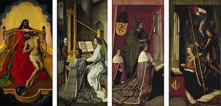
The Outer Panels

The four surviving panels will be considered in turn, starting with those visible when the triptych was closed.
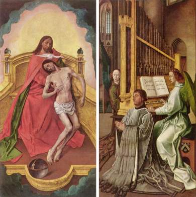
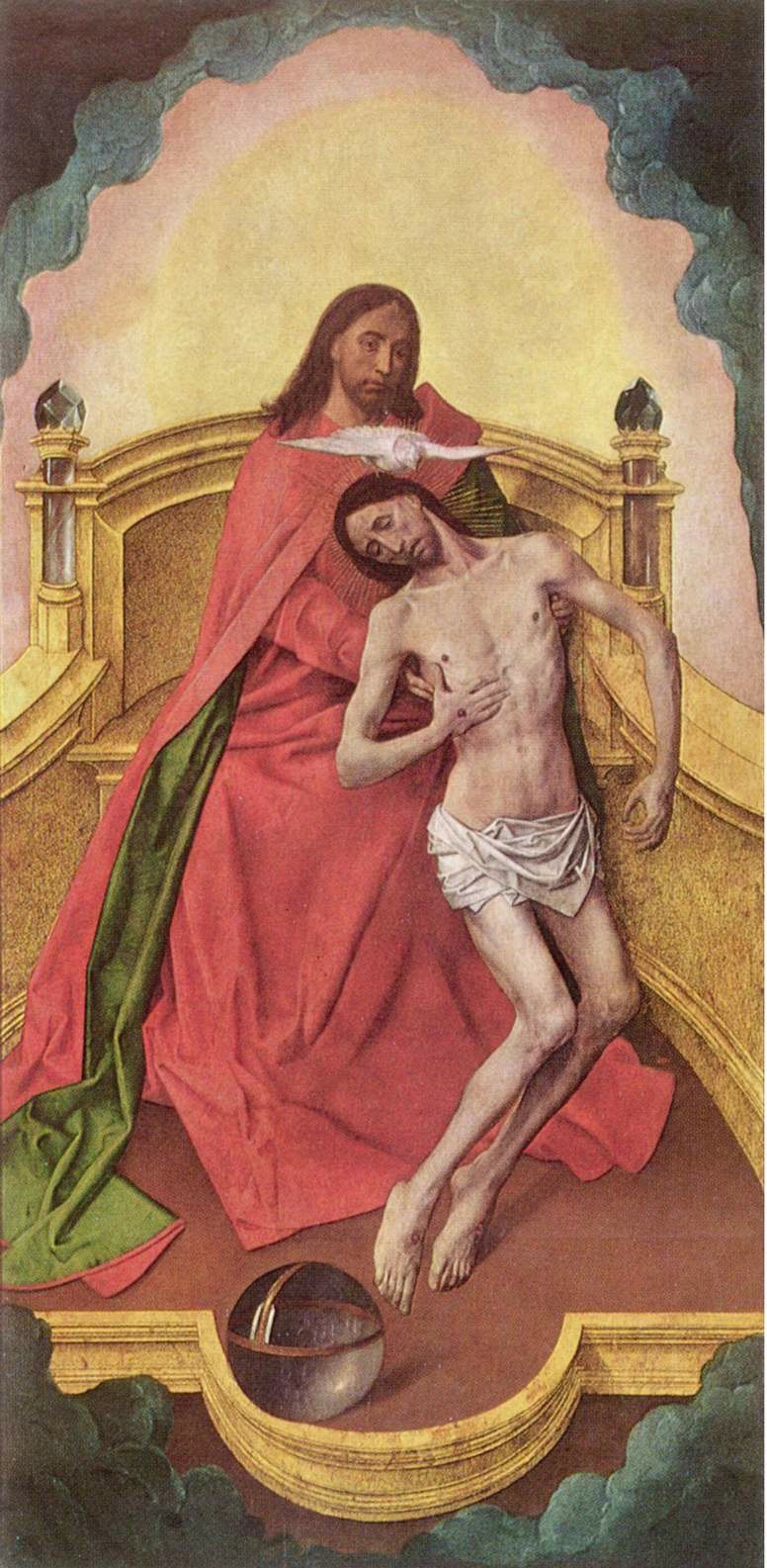
Image

The Trinity Panel

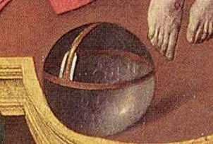
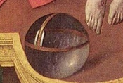
This depiction is what Panofsky entitled as a ‘Trinity of the Broken Body’4. Christ’s body is realistically rendered emphasising his physical suffering. God holds Him as He ascends, the dove of the Holy Spirit hovering over Them. At His feet is a crystal globe which represents the world of man which He saved by His sacrifice. Crystal objects were fairly common in Netherlandish paintings during this period. It was a sign of their innovation as well as their skill with oil based paints, enabling them to demonstrate their virtuosity.

Image

Such a painting would encourage the supplicant, kneeling at the altar, to reflect on their relationship with the Trinity. In fact, as this altarpiece was destined for a Church adjacent to a hospital one could imagine a patient kneeling before this emotive masterpiece seeking divine intersession.

Image

God is shown not as a wise old man but as the twin of Christ. This was a common device, especially in France dating back to the 13th century5, to emphasise that God was Christ’s Father and that man was created in His image. The background is beautiful and uplifting, representing the new dawn for those who follow Christ.

“I am come a light into the world, that whosoever believeth on me should not abide in darkness”6
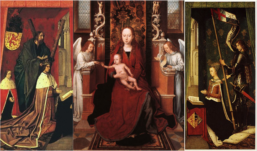
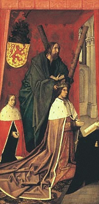
The Donor Panel

From all accounts this is a realistic portrait of Edward Bonkil who is believed to have commissioned van der Goes. He was the Provost of the Collegiate Church of the Holy Cross7, Edinburgh, the intended home for the altarpiece. Additional, identification is derived from the Bonkil family coat of arms prominently displayed on the organ stool.

Image

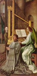
The prominence of the organ has oft been debated but it is believed that Bonkil donated such an instrument to the college in 1466/7. It has been posited that the inclusion of the organ was to flatter James III’s love of music. This has been challenged but it could have been included in reference to the image that this unpopular King wanted to project.
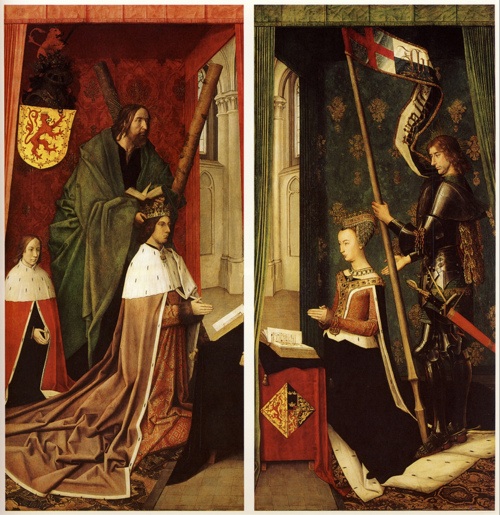
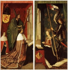
The Royal Panels

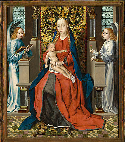
This is a ‘mock up’ of how the altarpiece would have looked when open. The illustration demonstrates how the figures of the monarchs would have related to the central panel8. The current consensus is that this panel would have been an enthroned Madonna with angels.

Image

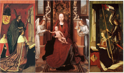
The likenesses of the monarchs have been verified with reference to other contemporary depictions. However, these portraits lack the clarity and realism of the outer panels. It is believed that they were copied from reference works or may have been painted by an assistant of van der Goes.

The King’s Panel

This crowded panel is full of political and nationalist symbolism. It depicts the aforementioned James III, kneeling at a prie dieu as if praying to the Madonna.

Image

The child is the future James IV which provides the best dating evidence. He was born in 1473 and his brother, James Stewart Duke of Ross, in 1476. As the contemporary convention was for the artist to include all living and even dead children, it seems likely that the altarpiece can be dated to 1473 – 1476.

James IV is a key character, not only for the future of Scotland and England but ultimately the formation of a united kingdom. He would marry Margaret Tudor, daughter of Henry VII, the founder of the Tudor dynasty. He was therefore not only Henry VIII’s brother-in-law but also uncle to Edward VI and Elizabeth I9. Unlike his Father, he was a successful monarch who united the clans; was excommunicated for pursuing war with England and after his death at Flodden Erasmus10 wrote his epitaph. He was considered a Renaissance man, founding the College of Surgeons, strengthening Scotland’s navy and speaking a number of languages including Gaelic. He, also, carried out experiments into the nature of language and studied alchemy.

Both monarchs are crowned and dressed in robes of state surrounded with the trapping of Scottish nationhood. In the King’s panel, the Lion Rampant is significantly reversed so that it faces the central panel. Behind James III is the figure of St Andrew the patron saint of Scotland with his cross, the satire, which would become Scotland’s national flag.
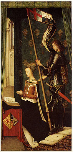
The Queen’s Panel

Finally, we have Queen Margaret, James III’s consort, mirroring her husband kneeling at a prie dieu before the Madonna. Her marriage played an important role in the formation of what is now recognised as Scotland, her dowry included both Orkney and Shetland.

Image

As with the King’s Panel there is an emphasis on Scottish nationhood. Her coat of arms as a Princess of Denmark is incorporated with that of Scotland. The Lion Rampant faces the correct way toward the missing panel. Behind her is a curtain adorned with thistles, James III was the first king to adopt this as the national emblem.

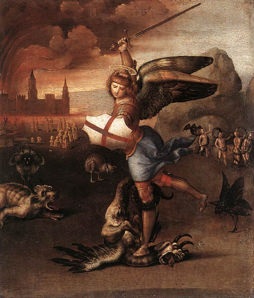
The consensus among art historians is that she is flanked by St George holding his red cross banner. However, given the tense relations between Scotland and England, it is unlikely that that the English patron saint would be included in such a Scottish altarpiece. Additionally, there is no evidence that Denmark, in general, and Queen Margaret, in particular, had any close facilitation with this saint. The Danish patron saint, adopted at this time, is Saint Canute or Knud II.

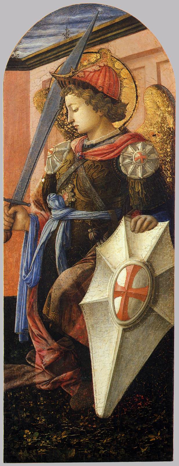
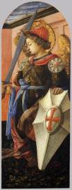
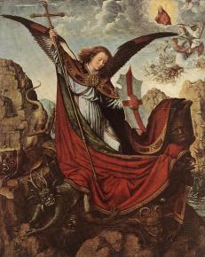
However, St Michael is frequently depicted in armour with a red Trinity Cross which would link back to the outer panel; these examples are by Lippi11 and Gerard David12. As the patron saint of the sick against evil, St Michael would have been an appropriate choice for a church adjacent to a hospital. This saint’s inclusion in this panel will be discussed in detail later in this paper.

Image                 Image

Religious/Political Background

Before considering why these panels would have survived the mid 15th century iconoclasm a brief review of the Scottish Reformation is needed to provide some context.

The Scottish reformation was, by and large, based on John Knox’s Calvinism. This promoted the primacy of ‘The Word of God’ and the suffering of Christ for man’s sins. Thereby, dispensing with the need for any mediator other then Him so there is no place for priests, bishops or devotional objects including statues of the saints and altarpieces. In fact, these objects were deemed dangerous as they may lead the sinner into worshiping the object itself and thereby breaking the second commandment:

“Turn ye not unto idols, nor make yourselves molten gods: I am the Lord your God”13

This Scottish reformation had a significant political aspect which explains the support from the aristocracy and landowners. They blamed the country’s weakness and difficulties on a succession of Catholic, child monarchs with foreign female regents. In fact, during his first meeting with Calvin John Knox asked him four questions on whether a child monarch should be obeyed; whether a woman could govern “by divine law”; the third and fourth questions were the crux of the matter:

“whether it was necessary to obey a magistrate who enforces idolatry and condemns the true religion?….. [and] to which party ought godly men to adhere if devout men of position resist an idolatrous king by war”14.

Calvinism was particularly attractive as he separated the role of monarch from the individual. In addition, the emerging religion was communicated in the language of the people – Scots. This strengthened the perception of the reformed Church as a National institution15.

“In Scotland the unyielding reformers delivered themselves from the dregs of popery in a characteristically sweeping manner, offering an example of iconoclasm quite exceptional in its thoroughness”16

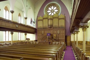
Vigilance against such idolatry is still predominant in The Church of Scotland and therefore continues to influence architecture and interior decor. This is typical a interior of today’s Kirk17, note the lack of altar and the prominence of the pulpit from where ‘The Word’ is preached.

Image

Central Panel

Before considering the surviving panels through a Knox prism, one question must be explored further. Why did the central panel fail to survive?
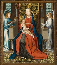
Image18

There is no evidence of what the central panel looked like. The fact that the king, queen and lion rampant are facing the centre is suggestive of its existence. Art historians, including Panofsky, appear to have come to a consensus that the central panel was an enthroned Madonna with Angels a pattern which was utilised by van der Goes’ contemporaries include van Eyck and Memling.

Such subject matter was a focus for the iconoclasts’ wrath especially when included in an altarpiece which was the focal point for the despised Catholic mass. As early as the 1533 Lord Ochiltree19 decapitated a statute of the Virgin Mary. As well as representing a redundant mediator and object of veneration, the image of the Madonna was wrapped up in superstition and belief in witchcraft prevalent in Scotland at this time. Therefore, such images and objects received ritual hangings and burnings. This harked back to pre-Christian beliefs that to this day have resonance for many Scots. Additionally, Mary may have been viewed as a symbol for the mistrusted foreign female regents, all Mothers of Kings just like the Madonna.

The Trinity Panels Revisited

If the central panel failed to survive then why might the other panels ‘buck’ the trend? Revisiting the iconography of each of the panels in light of the developing religion may bear fruit. In this exercise it is not the original intentions of the Donor or painter that are important but how the elements were viewed by the contemporary viewer.

Image

The Royal Panels

The surfeit of Scottish nationalist symbols would be attractive to a ruling class seeking to re-establish the position they believed their nation should hold on the European political stage. The use of the Lion Rampant, the patron saint of Scotland, the thistle, in addition, to the inclusion of key monarchs in the development of the country all serve to underline the nationalistic tone. As previously stated the Scottish Reformation was not purely a religious movement. The political element sought to rid the land of the corruption of the Roman Church and to see a King of the new religion on the throne to defend Scotland from foreign influence, not just from Rome but also France and, of course, the traditional enemy to the South.

With the central panel removed the King & the Queen appear to be kneeling before The Bible, before ‘The Word of God’. In fact, it looks as if St Andrew is instructing the King in the scriptures, thus the primacy of ‘The Word’ is prominent, in keeping with Calvinist beliefs.

Image

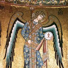
What of St Michael? He is the Archangel depicted in art throughout the centuries as the leader of the celestial armies who defeat Satan. Given the upheaval of the mid 16th century this would have been an engaging allegory for the struggles to establish the reformed church. St Michael leads the armies of Calvinists against the evils of the Roman church enshrined in The Westminster Confession:

“He [the Pope of Rome] is Antichrist”20

Image21   Image22

St Michael’s holy day was not abolished until the 18th century. This day incorporated Scottish superstitions toward evil, when struans (or Stron bread) were traditionally baked in the shape of the Trinity Cross. ‘Struan’ means ‘small stream’ in the Gaelic. Many ancient magical wells were dedicated to St Michael when Christianity sought to replace the old beliefs. However, Scottish superstitions regarding the supernatural prevailed e.g. David I acknowledged these beliefs in law and James VI/I belief in witchcraft was so well known that Shakespeare included it in his Scottish play, ‘Macbeth’.

The royal panels also include a Danish princess and her coat of arms. The reformed churches of Scotland and Denmark not only recognised but also admired each other23.

The Donor Panel

This panel links the history of the Scottish monarchy to the reformers of St Andrews. Robert II was the founder of the Stewart dynasty and his Great Aunt by marriage was an ancestor of Edward Bonkil. While one of his descendents John Bonkil is recorded as a member of the St Andrews Kirk Session in 1569 24 and the ‘clerk-deputy’ of the city of St Andrews in 1573 25. It is unlikely that such family would have been unaware or kept a secret of their stellar lineage.

As for the inclusion of the angels – these did not offend the emerging doctrine. Their existence was never denied merely their ability to mediate on behalf of man.

All three panels appear be within the interior of the same church. A plain, stone building without adornment statutory or stain glass windows. It could be viewed as church cleansed of idolatry. This is in keeping with Calvin’s ideal that the beauty of God is not in the fabric of a building but in the worship of the people within it.

The Trinity Panel

The depiction of God is in strict violation of the tenets set out by Knox and such images were destroyed during the cleansing of the churches. However, as previously stated God is depicted as the twin of Christ. This common practise in France dating from the 13th century was based on the 110th Psalm:

“The Lord said unto my Lord,

Sit thou at my right hand,

Until make thine enemies thy footstool” 26

Although the Calvinists embraced the Psalms it is still unlikely that an image of God would pass the ‘graven idol’ test. The man behind Christ does not look like God merely someone lifting Christ to heaven, perhaps showing the soul departing the broken body.

The Christ figure is shockingly realistic, his suffering is clear for all to see and a key element for followers of Calvin & Knox. However, this panel still represents a fundamental weakness in the theory explored in this essay. Any depiction of the Trinity would be viewed as a devotional object and therefore would have been a target for those who took up the call to “…purge the kyrk of all kynd of monuments of idolatrye”27. Therefore, this panel’s survival may be attributed merely to the fact that it was on the reverse of King James III.

Conclusion

Waagen “recommended that art historians attend to politics, history, the character of the people, religious structures, customs, literature and the nature of the land in order to understand the artist…”28. Therefore, this paper is based on art historical theory, changing & developing religious doctrine, the political climate as well as the views and beliefs from contemporary Scottish society.

A classic iconographic approach would have sought the contemporary meaning(s) within the motifs depicted on the panels. Although, this has been identified as a weakness of Panofsky’s methodology, the quote on title page demonstrates that Panofsky was interested in the contemporary views as well as texts and traditions. The weakness in the pure iconographic approach, especially with Northern Renaissance art, is that it does not consider how such perceptions may change over time especially during periods of social, political, economic and religious turmoil. A great deal of art from this period was lost as a direct result of these changing perceptions.

Many art historians have commented on the ‘miraculous’ survival of Van der Goes’ ‘Trinity Panels’. This essay has attempted to demonstrate that the iconography of the survivors may have contributed to this ‘miracle’.

Post Script

One important historical fact has been ignored. During the ‘rough wooing’ of 1544 English forces commanded by Edward Seymour, the then Lord Hertford, sacked and looted both Edinburgh and Leith. However, the invaders did not lay siege to Edinburgh Castle keeping out of range of its cannon. As Collegiate Church of the Holy Cross was within this protective curtain it is unlikely that the painting was taken south at this time.

Endnotes

1 202 x 100.5 cm, oil on oak – on indefinite loan to the National Gallery of Scotland

2 Panofsky, quoted in Held, J S “Early Netherlandish Painting”, The Art Bulletin, Vol. 37, No. 3 (September 1955), p212

3 They are next recorded in the possession of Queen Anne, Princess of Denmark, the consort of James VI/I in Oatlands Palace in 1617.

4 Blum, S N “Early Netherlandish Triptych”, Berkeley: University of California Press, 1969, p 56.

5 Denny, D “The Trinity in Enguerrand Quarton’s Coronation of the Virgin”, The Art Bulletin, Vol. 45, No. 1 (March 1963), pp 48-52.

6 John 12:46

7 Founded by Margaret Guelders James III’s Mother/ and regent.

8 Hans Memling’s “Virgin & Child Enthroned with Two Angels”, 1485 – 1490, St Osyth’s Priory, St Osyth.

9 To many in England the Scottish claim to Elizabeth’s throne was stronger in light of whether she was considered illegitimate or not.

10 Teacher to James’ illegitimate son Alexander.

11 Filippo Lippi, “St Michael” c. 1456 – 58, Cleveland Museum of Art, USA.

12 “Altarpiece of St Michael”, late 15th Century, Kunsthistorisches Museum, Vienna.

13 Leviticus 19:4

14 Eire, C M N “War Against Idols”, Cambridge: Cambridge University Press, 1989, p277.

15 The Scottish National Church was established in 1560.

16 Ashton, M “England’s Iconoclasts, Vol I”, Oxford: Clarendon, 1988, p60.

17 St James Parish Church, 1 Prestwick Road, Ayr.

18 Master of the St. Lucy Legend’s “Madonna and Child with Angels”, c. 1475 – 1483, Los Angeles County Museum of Art, USA.

19 The grandfather of the future and second Mrs John Knox.

20 Chapter 29 Section 2, The Westminster Confession, http://www.churchofscotland.org.uk/about_us/our_faith/westminster_confession_of_faith (viewed on 10 March 2013)

21 Archangel St Michael, Cathedral Cefalu, Sicily 12th Century.

22 Raphael, “St Michael Overwhelming the Demon”, c 1505, Louvre, Paris.

23 Donaldson, G “’The Example of Denmark’ in the Scottish Reformation” The Scottish Historical Review, Vol. 27, No. 103 Pt. 1 (April 1948) p58-59.

24 University of Glasgow/University St Andrews: The Scottish History Society http://www.scottishhistorysociety.org/media/media_173536_en.pdf p323.

25 Archaeology Data Service http://www.ads.ahds.ac.uk/catalogue/adsdata/arch-352- 1/dissemination/pdf/vol_047/47_174_208.pdf p199.

26 Denny “The Trinity in Enguerrand Quarton’s Coronation of the Virgin”, p49

27 Fleming, D H “The Influence of the Reformation on Social and Cultural Life in Scotland’, The Scottish Historical Review Vol. 15, Bo. 57 (October 1917), p16.

28 Quoted in Belozerskaya, M “Burgundian Arts Across Europe”, Cambridge: Cambridge University Press, 2012, p31